

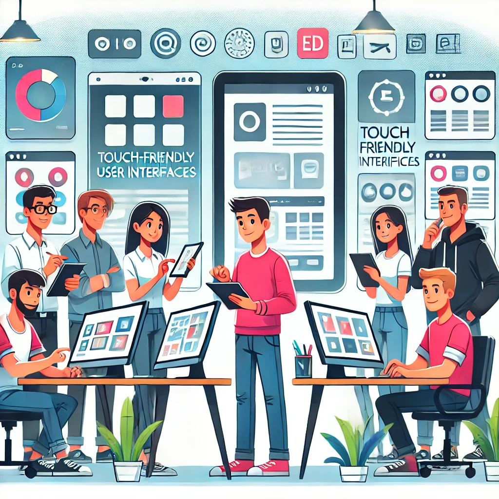
Understanding Touch Friendly UI
Making the touch-friendly experience available on all digital platforms is a must, not an option. A touch-friendly user interface (UI) gives a lot to a smooth and enjoyable user experience.
Why Touch Friendly UI Matters
A good, touch-friendly design can really help how users interact and stay engaged. This is a fact, not a guess, supported by years of study on comfort and usability. In the online world, fast and easy navigation is very important. It lowers the risk of frustrating users and losing their interest. It’s like turning the pages of a book easily without any trouble. This creates a good feeling and makes using the site better.
Basic Principles of Touch Friendly UI
When making a touch-friendly user interface, you should keep two main ideas in mind to help with your work.
- Thumb Zones: Most users use their thumbs to interact with devices. It’s important that important actions and content are easy to reach in the thumb zone. This area is usually in the center and lower part of the screen. Placing key content here helps users who use one hand. It also makes the device easier for everyone to use.
- Grip Variability: Think about the different ways users hold their devices. Depending on what they are doing, users may hold it with one hand, cradle it, or use both hands. A design that can adapt to these different grips makes using the device better for everyone. This variety is not just interesting but also key to good user interface design.
Real-World Examples of Touch Friendly UI
I will look at touch-friendly UI. Many apps and websites show these main ideas. They give users a simple and special touch experience. Let’s check out some well-known examples from apps and websites.
Popular Apps With Touch Friendly UI
Popular apps like ‘Uber,’ ‘Instagram,’ and ‘Tinder’ promote easy-to-use touch screens.
- Uber has a user-friendly interface that focuses on touch. It has a smooth map feature that reacts to how users touch the screen, like pinching to zoom in or dragging to choose a spot.
- Instagram is a well-known social media app that uses easy touch movements. Users can scroll quickly, like posts with a double-tap, swipe left or right for more images, and press and hold to see photos. All these actions make the touch experience better.
- Tinder, a dating app, made the ‘Swipe Left or Right’ motion popular. This simple action has made it easy for users and has really increased engagement, showing how effective touch-friendly designs can be.
Websites Excelling at Touch Friendly UI
In the world of websites, ‘Google Maps,’ ‘Amazon,’ and ‘Apple’ are some names that stand out for their friendly interfaces.
- Google Maps is always working to improve user experience with its touch-based navigation. Users can simply zoom, pan, and move the map using touch commands. This makes it easy for users on tablets and mobile devices.
- Amazon serves millions of users with a user-friendly design. Their website makes scrolling, selecting, and buying easy for those who use touch screens.
- Apple is well-known for focusing on details. They provide a touch-friendly layout on their website. They arrange every part of the page to make navigation easy for touch users, which sets them apart from others.
Creating a Touch Friendly UI
In order to boost user engagement, having a touch-friendly User Interface (UI) is very important. Follow these tips to do this well.
Adjusting for Different Screen Sizes
To create a good touch UI, change your design for different screen sizes. The elements you design, like buttons and links, need to be big enough for easy tapping without mistakes. A good size to aim for is about 44×44 pixels. Keep in mind that the goal is to help users use your design smoothly, no matter what device they have.
Designing for Finger Navigation
Consider how users use their fingers on touch screens. A key part of a touch-friendly design is making sure touch targets are spaced well. It is important to space them correctly to prevent accidental taps. This is especially true for users with larger fingers or those who have trouble with lighter taps. For easier navigation, main content and actions should be in the center of the screen. Place less important actions and navigation options at the edges or in menus to keep the interface looking clean.
Optimizing Browsing Flow
Direct manipulation can really improve the browsing experience in a touch-friendly user interface. Simple designs help to prevent frustration when users face a screen full of too many elements. Let your users connect directly with your content in ways that feel like real-life actions. For instance, allow them to swipe to delete an item or pinch to zoom in.
Make sure your design quickly responds to touch inputs. This can be simple changes like the color of a button or feel vibrations; users like to know right away that they touched something. When designing, aim for an interface that is not only responsive but also quick to react. This will help create a smooth experience for users.
Your design should be easy to use for everyone, even those with disabilities. It is important to practice inclusive design. You need to test it in a way that is friendly for all people. This helps find and fix any problems with accessibility.
Techniques for Testing Touch Friendly UI
Finding great ways to test your touch-friendly interface is very important for a good user experience. Here, we look at classic usability testing and discuss the benefits of real user monitoring.
Traditional Usability Testing
Traditional usability testing is a key part of any UI testing plan. It involves having users carry out tasks while you watch how they interact with your interface. This method gives you valuable information about how well your UI works. For example, Google Analytics is a common tool that shows how users move around your site, how fast it loads, and other important details. Remember, testing usability early and often can help you spot and fix UX problems before they get worse.
Real User Monitoring
Real User Monitoring (RUM) is a modern way to check how well a touch-friendly interface works. Unlike synthetic monitoring, which tries to mimic user actions, RUM records what real users do in their own environment. Tools like Dynatrace or New Relic provide good insights about how users work with your interface. This includes load times, paths of transactions, and the type of devices they use. A key benefit of RUM is that it spots issues in real user behavior. This way, you can know about problems before they impact more users.
Creating User Interfaces that are Easy to Touch: Common Problems and Solutions
Creating a touch-friendly user interface has some common challenges. When we handle these issues well, we get a design that works for everyone and responds easily.
Overcoming Fat-finger Problem
A big worry in making touch-friendly user interfaces is the ‘fat-finger’ problem. This happens when users touch the wrong targets that are next to the right one. It is an issue caused by the inaccuracy of human touch when we compare it to a mouse click. Good ways to fix this include:
- Making touch target size larger: Bigger touch targets help prevent wrong touches. This lowers the chance of misclicks. Even though the screen space is limited, you can often make targets bigger without changing the overall layout much. For example, Apple says that touch targets should be at least 44 pixels wide and tall.
- Keeping enough padding: Adding space between touch targets can lower the risk of touching the wrong one. Padding acts as a safety area, which cuts down on mistakes caused by hitting the wrong target.
Accommodating Both Touch and Non-Touch Users
An interface must support both touch and non-touch users to promote inclusivity. Key points for this support include:
- Responsive design: A good interface must change automatically based on how you use your device. This means it should work well with touch, a mouse, or a keyboard. Navigation menus should be easy to use whether you click with a mouse or tap with a finger.
- Dual navigation options: Links, buttons, and menus should work with regular keyboard keys and touch actions. This helps users who switch between input methods feel comfortable.
- Contextual changes: An interface should notice and change how it behaves based on the user input method. For example, it could make buttons bigger when it sees that you’re using touch input.
To meet the needs of both touch and non-touch users, you need good planning, testing, and a design process that improves over time. Though it can be tricky, solving these issues leads to better usability and happier users.
Future Trends in Touch Friendly UI
As you know, a touch-friendly interface is not just a design trend. It is a key part of our digital world today. Understanding and using touch-friendly design can really improve how users feel when using your product. The ‘fat-finger’ problem is a challenge, but it can be solved. You can make touch areas bigger and add space around them. This way, you create a simpler and better interface. It’s important to think about both touch and non-touch users to give everyone a smooth experience. You can achieve this by using responsive design, having two types of navigation, and making changes based on the context. As we move ahead, these methods will keep changing and help shape user interfaces. Keep an eye on these trends and adapt to keep your interface easy to use and focused on users’ needs.

